Web Typography: a Refresher and History
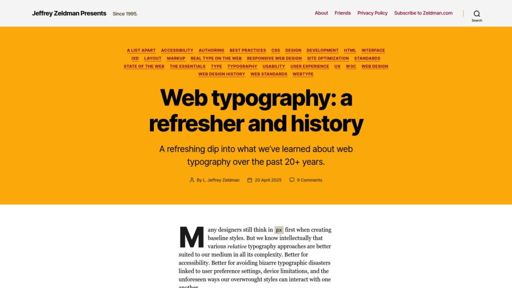
Web typography history and overview by Jeffrey Zeldman.
https://zeldman.com/2025/04/20/web-typography-a-refresher-and-history/
Web typography history and overview by Jeffrey Zeldman.
https://zeldman.com/2025/04/20/web-typography-a-refresher-and-history/
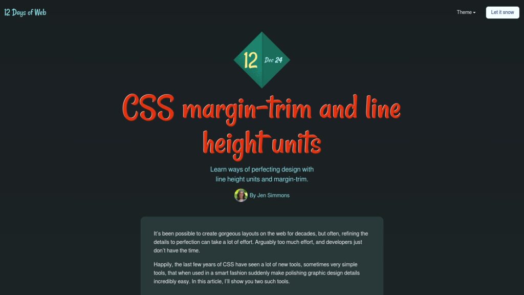
CSS has introduced powerful tools for enhancing web typography: line-height units (lh and rlh) simplify layout adjustments by tying sizes to text rhythm, and margin-trim removes unwanted space from paragraphs against containers. Both features improve design aesthetics with minimal effort, although support varies by browser, requiring progressive enhancement techniques for wider compatibility.
https://12daysofweb.dev/2024/css-margin-trim-line-height-units/
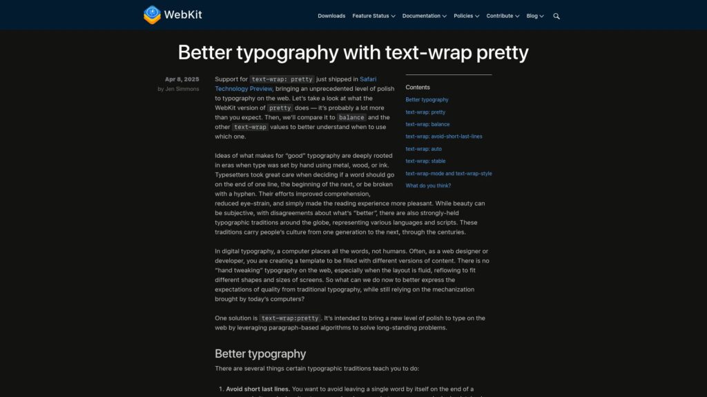
Safari's text-wrap: pretty improves web typography, addressing issues like short last lines, bad rag, and hyphenation. Traditional typesetting standards are used in a computer-driven layout, offering qualities such as better readability. The feature leverages paragraph-based algorithms for enhanced text presentation. text-wrap: balance is another option but should be used for shorter texts rather than long paragraphs. Performance concerns are minimal with proper implementation. The feature is actively available for testing in Safari Technology Preview 216, suggesting users explore its impact on text appearance.
https://webkit.org/blog/16547/better-typography-with-text-wrap-pretty/
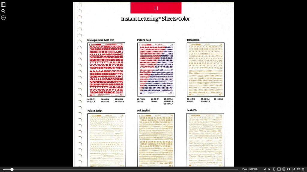
Letraset Communication By Design by Letraset USA is a 1987 publication available on the Internet Archive for free download and streaming, featuring design and font references. It includes a supplement for graphic design software and Pantone colors, scanned at 600 dpi. The document has wear from use in a graphic firm and some pages have partial loss due to misregistration.
https://archive.org/details/letraset-communication-by-design/page/11/mode/1up?view=theater
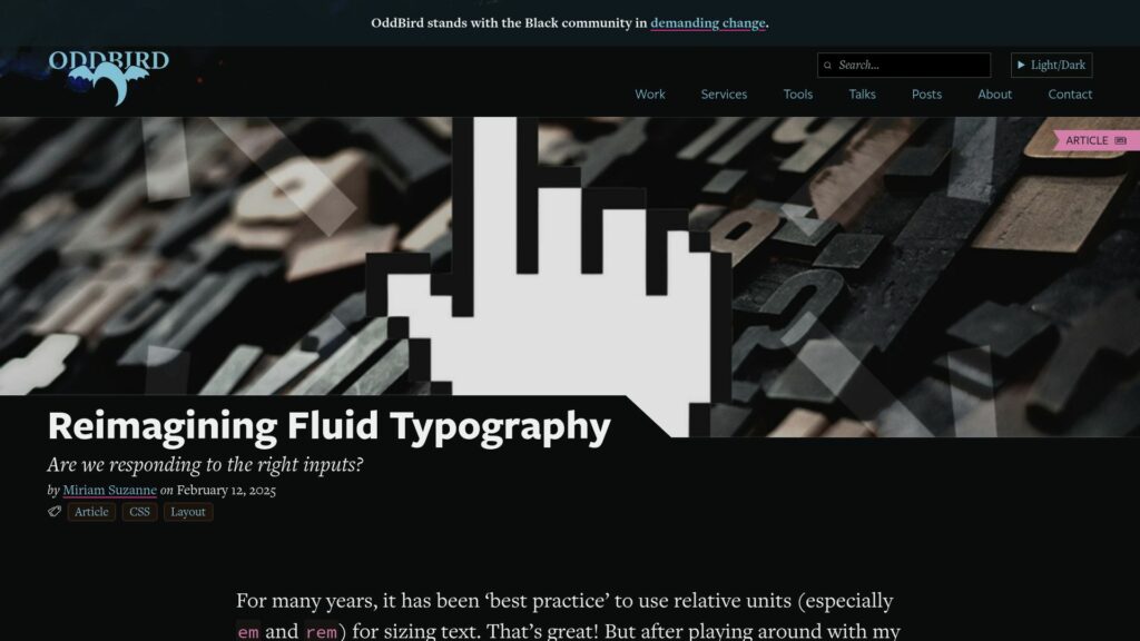
TLDR: Explore improving fluid typography by using relative units (like em and rem) in a responsive way, avoiding assumptions like 1rem = 16px, and advocating for user preference settings in browsers to enhance readability across different devices and contexts.
Letterform Archive offers a ten-week type design course, membership options with benefits, various events, workshops, and a vast collection on typography and design education. The nonprofit aims to inspire and educate enthusiasts with exhibitions, lectures, and an online archive. Recent highlights include publications on notable designers, themed exhibitions, and curated gift ideas for designers.
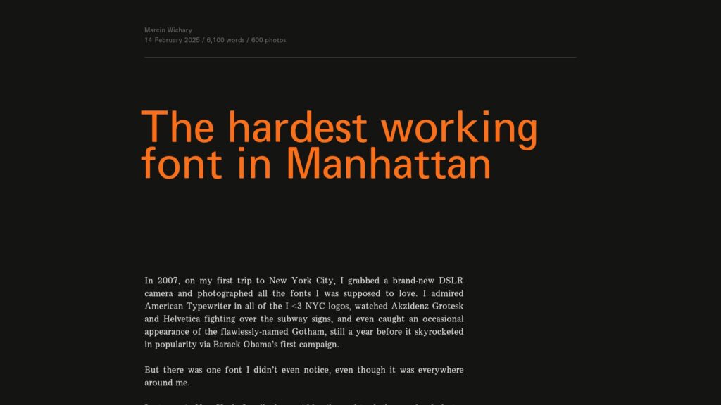
Gorton, an overlooked font, has been widely used since the early 20th century, originating from a British engraving company, Taylor, Taylor & Hobson. Despite its quirky and simplistic design, Gorton became a go-to typeface for various applications, including engraving machinery and signage. It was favored for its durability, with letters integrated into key materials, and later adapted into manual lettering kits. Over time, Gorton influenced many forms and applications of typography, including military specifications and computer graphics, all while remaining largely unnamed or generically labeled. The font's presence spans from everyday items to significant historical contexts, including its use in spacecraft. Gorton’s legacy reveals an unexpected prominence in the history of typography, distinguishing itself despite being perceived as unattractive.
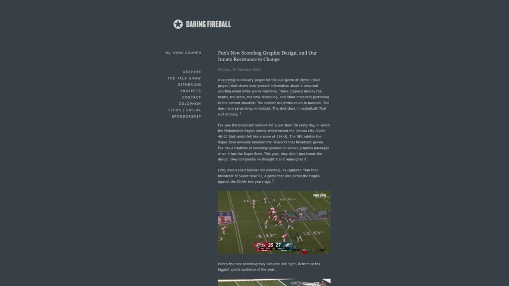
Fox debuted a redesigned scorebug for Super Bowl 59, sparking mixed reactions. Initial negativity stemmed from human resistance to change. Upon closer examination, the new design—characterized by clear typography, elimination of unnecessary visuals, and effective use of team initialisms—rose in approval. Observations highlight clarity in conveying game info, contrasting with outdated previous designs. The industry trend shows scorebugs have evolved significantly since their inception, with Fox playing a key role in shaping modern broadcast graphics. Change, though often disfavored, can yield improvements.
https://daringfireball.net/2025/02/fox_new_scorebug_graphic_design
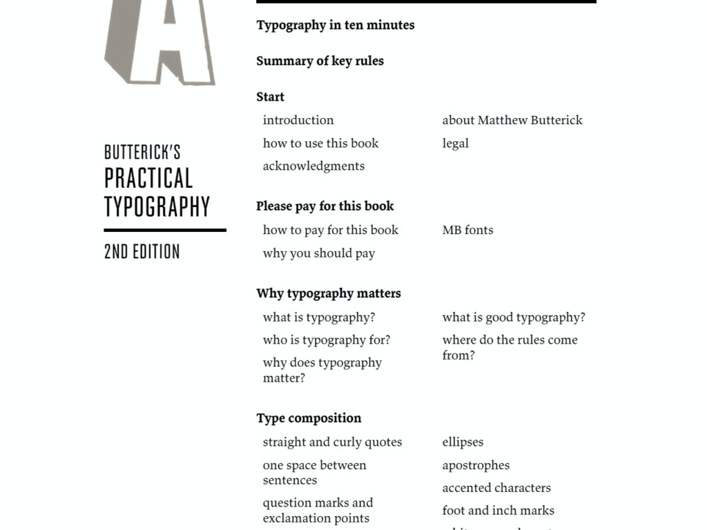
Butterick's Practical Typography is considered one of the best resources for learning typography. Written by Matthew Butterick, a lawyer and typographer, this online book concisely covers typography's fundamental rules and best practices.
I recommend this book to anyone looking to improve their typography skills, whether you're a graphic designer or writer or want to create more professional-looking documents. Here are some of the main reasons why it's such an excellent guide:
The book starts with a chapter called “Typography in Ten Minutes” that distills the core fundamentals into five key rules. Butterick boldly claims that if you learn and follow these rules, you'll be a better typographer than 95% of professional writers and 70% of designers. While that may sound boastful, the rules cover the typographic basics clearly and effectively.
Butterick doesn't just state the rules; he takes the time to explain the rationale behind typographic conventions. Understanding why certain practices are recommended allows you to flexibly internalize and apply the principles rather than just following arbitrary rules without knowing why.
The book examines typography from a visual perspective and a practical, technical angle. So you'll learn artistic concepts like creating contrast, hierarchy, and consistency just as much as specific settings like font size, line length, and spacing.
Butterick has done extensive research to base his recommendations on proven best practices. As he says, the rules of typography come from “a few hundred years of type and typography,” establishing conventions through trial and error. So you can feel confident learning from an expert who knows the reasoning behind the rules.
Despite the wealth of information, Butterick is remarkably concise and clear-cut in his writing. He gives specific, practical examples to illustrate his guidance. The book is meticulously organized to be skimmable and easy to reference later.
So, in summary, Butterick's Practical Typography offers an ideal starting point for learning typography by focusing on the fundamental rules, explaining the why behind conventions, covering both aesthetics and technical configuration, building on proven practices, and presenting the material in a focused, digestible way. I highly recommend designers or anyone working with type give it a read.